The Brief
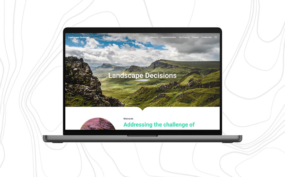
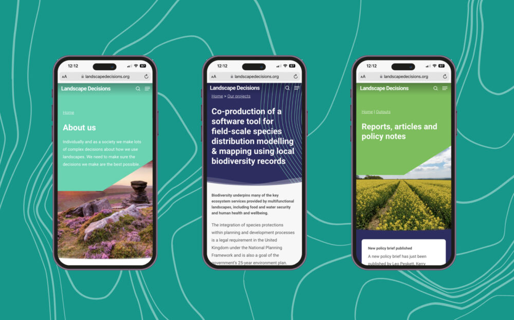
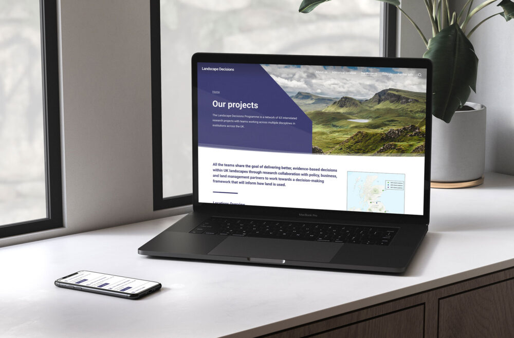
We worked with Landscape Decisions to design a new website dedicated to showcasing the legacy research and frameworks they have gathered across their five-year programme. Our core goal was to improve the content structure throughout the website, creating a more visually dynamic layout while also improving navigational journeys to key content areas such as the project archive and project article pages.
Our approach
With over 50 projects across 30 locations, the project’s archive is one of the most visited areas of the site. We introduced a project filtering system to make it easier for fellow researchers to filter content by category. Due to a limited bank of images within the projects section, we generated vector silhouette illustrations to represent each category, allowing the user to visually distinguish each project type in an eye-catching way.
UI styles
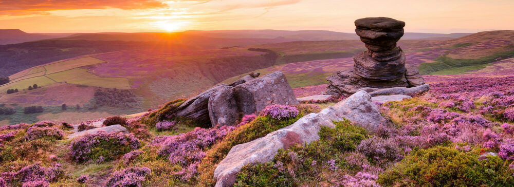
As this was a UK Research and Innovation-funded programme, we took inspiration from their UI toolkit which included a combination of bright colours and textures inspired by landscapes. We combined these with a selection of breathtaking British landscapes; which especially focused on heathlands and farmlands as these are some of the core areas the programme focused on.
The results
The new website enables a better reorganisation of displaced content, creating a better user experience for fellow researchers to continue delivering better, evidence-based decisions for UK landscapes.


