Brief
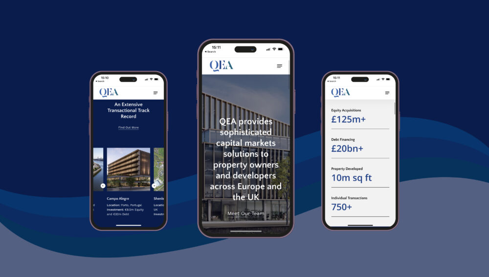
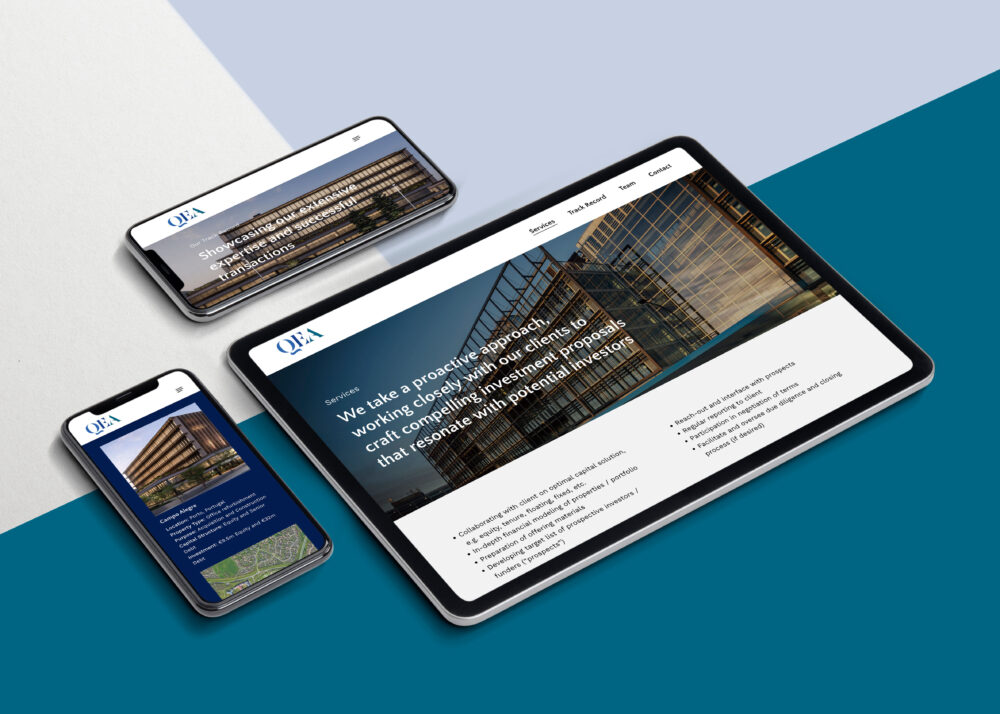
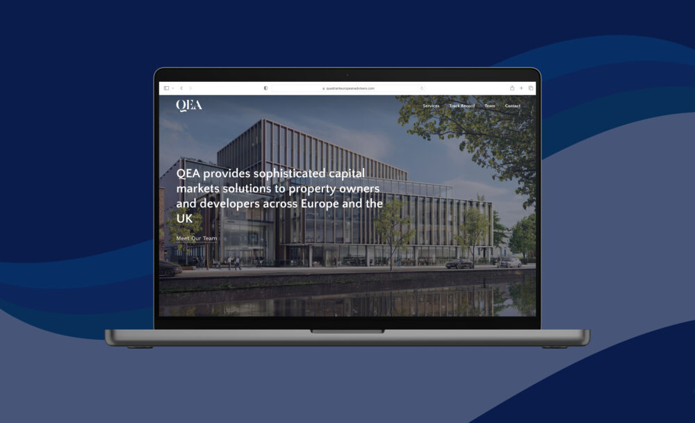
The brief was to develop a new visually appealing brand for QEA. It needed to be modern and approachable, with a nod to the history and expertise of the two partners rooted in real estate investment and development. Secondly, they required us to design a minimalist site hosting comprehensive information about the company’s services and solutions while being easy to navigate.
Work carried out
LUV developed a new, bespoke logotype design. We drew inspiration from the quill, with a modern emphasis on calligraphy shown through the tail of the Q. The colours combine the partnership of brand colours from Quadrant Real Estate and Osborne+Co. We were also tasked to design and build the website and advised the client team on the content and the layout. The website features a clean and modern design with a simple navigation menu that makes it easy for users to find the information they need.
The Results
The website is well-received by the client and their site visitors in promoting the new partnership. The new brand helps increase the company’s visibility, expressing the gravitas of their combined expertise to help generate new business leads and the goal of being recognised as a leading provider of capital markets solutions in Europe and the UK.


