Introduction
As an association, QRA’s membership programme is open to anyone interested in the advancement of education and research into the Quaternary period. They host a range of field meetings, workshops and discussion events and run an extensive grant scheme for members.
The brief
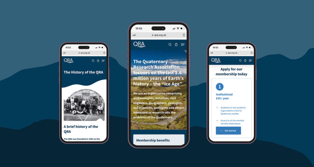
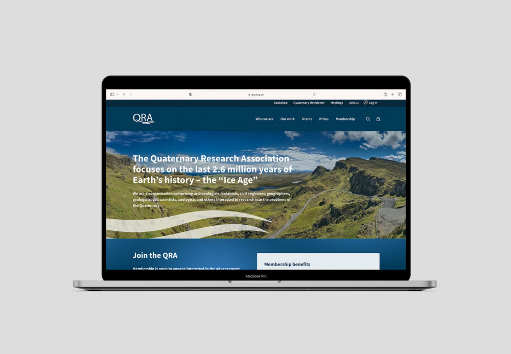
We worked with QRA to design a new website that was not only visually engaging, but also dramatically improved the user experience of their membership sign up and payment processes. Our goal was to make the membership sign up process more automatic and streamlined, therefore reducing the amount of admin work for QRA team members and increasing member sign ups.
An improved members area was also needed so that members could access documents and information that is only available to their particular membership level, with the ability to get automatic discount codes for books within the QRA’s integrated shop.
Our approach and challenges
One of the main challenges users experienced with the original website was purchasing field guides and technical guides from the online bookshop. By setting up Woocommerce within the new website, we created a more streamlined payment process for both admin and customer. The overall shop is now easier to navigate with a dedicated filtering and sorting system. Clear and prominent call-to-action modules within the shop page also encourage potential customers to sign up as members and receive discounts on books.
We also improved the grant and prize application form process. Previously, these forms were only available as PDFs that had to be printed off. By designing progress forms with Gravity forms, we created a streamlined application process, that was more accessible across multiple devices. This system has also helped the QRA staff keep all application entries archived in an organised manner.
UI and UX
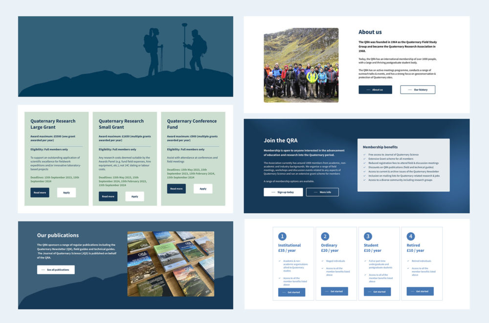
We took inspiration from the curved shapes within the QRA logo by adding curved edges to modules and imagery, creating a further connection between the brand and website. Due to a limited bank of images, we generated vector silhouette illustrations throughout the website to add visual interest, whilst also promoting diversity and inclusion.
The results
Our communication workshops combined with content evaluation, navigation labelling, UX and UI has helped re-organise displaced content and create a better user experience for potential and existing members of the QRA.
We hope this website will allow new potential members to sign up to the association, to increase engagement and education of the ‘Ice Age’ period.


