Introduction
We worked closely with WPH to fine tune the overall message they wanted the new brand identity to deliver through a series of workshops and feedback sessions. It was important to the client and us that we managed to establish a logo that best represented their missions, visions and goals. After establishing this logo, we then created a set of brand guidelines which supported us as we established their new corporate plan, launching their new brand identity to the world.
Our approach
The new, fresh logo emphasises a sense of togetherness and community through the image of the connecting houses. As this incredible Housing Association has been running for over 100 years, we felt it was important to recognise this within the logo as a badge of honour, by including ‘Est 1920’ within the typographic treatment. We wanted to root back even further into the theme of history and heritage by using purple and green colours within the logo; both used as colour identifiers of the suffragists during the early 20th century.
In order to pave the way for a new accessible brand identity, a humanistic, modern typeface was used throughout so that it could be understood by everyone.
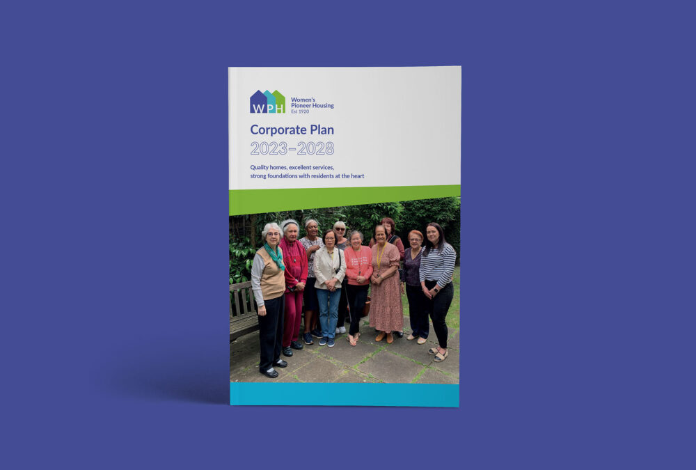
After establishing our brand identity, we then used our guidelines to create a new corporate plan for WPH. Through this exercise, we established a document template style, developed upon our existing illustration styles and also considered how our new colour and typography would be used within this treatment.
The results
The cornerstone of this new brand strategic language and colour ways was the idea of “Offering single women access to safe, secure and good quality affordable homes and services”. With this mind we hope the new brand identity will continue to influence other housing providers so they understand the needs of single women and offer services that meet this need.


