
This article shares our insight and approach to designing for wayfinding, and we’ve split this into two parts. This first part is an opening introduction to wayfinding, which includes the initial steps and procedures and building a visual language for wayfinding implementation. Part two will cover the implementation, installation and maintenance of the wayfinding systems.
In healthcare, confusion costs time, money, and trust. An effective wayfinding system in and around reduces anxiety, protects clinical time, and improves punctuality. The most reliable results come from evidence‑led design, disciplined collaboration, and a governance model that keeps information accurate as services evolve.
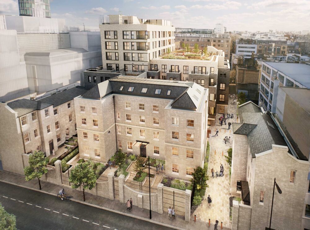
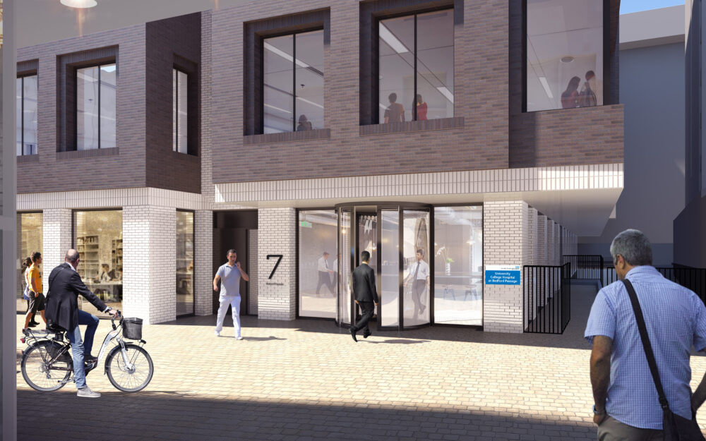
Mixed-use buildings and locations can multiply anxieties further due to the number of users and different end goals they may have. For example, within the Bedford Passage development, there are various residential buildings, office/retail, clinical users and local residents/users passing through the same external areas which may make it hard for a patient to navigate during difficult periods of health concerns.
The value of research and data gathering
Evidence is the foundation for strong wayfinding, which begins with observing real journeys and validating findings with data in context to the location or clinical settings. Short, structured interviews and on‑site shadowing reveal where people hesitate, which terms confuse them, and how peak‑time pressures alter behaviour. We pair these insights with baseline measures—such as average journey time for top routes, wrong‑turn rates at specific junctions, and staff interruptions for directions—to target interventions and justify investment.
Not investing in research and utilising genuine data can often create negative user interactions, such as users getting frustrated and stressed, failing to clearly find locations and in some cases heading to the wrong location entirely. Having frustrated and stressed users within a clinical setting can be detrimental to both the users and the staff, which can cause unwanted arguments and misunderstandings, creating an uncomfortable working environment.
Involving clinicians (UCLH), architects and interior designers (Llewelyn Davies) as part of the research process also allows us to plot primary and secondary decision points quickly—critical locations where users must choose a direction or confirm they are on the right path. Using this information we can make sure the correct signage is selected and well placed and ultimately utilised effectively. Defining this information and deciding whether it is relevant to each user is an important part of the process. Creating a simple hierarchy of information would help benefit the reference of this information
Early reviews with Bedford Passage and with clinical operations help reconcile intended circulation with actual flow. This is the right moment to embed accessibility expectations—contrast, legibility, mounting heights, and inclusive access—so compliance is designed in, not added later.
Context matters in the UK, and a terminology audit allows aligning taxonomy, staff language, and signage, so people are never asked to translate “Radiology” into “X‑ray” under stressful patient journeys. The NHS, in particular, adopts the term “Way Out” instead of “Exit” due to it being a British standard and differentiating from emergency exit (green signs) routes or compliance signage. The term “Breast Care Centre” is used to encompass the different types of patient care being delivered in the unit, rather than focusing solely on diagnosis and potentially heightening patient anxiety. They also avoid using pink and purple in reference to the department, both to comply with the trust’s main corporate colours and also to avoid over-lapping with the pink-washing approach adopted by many commercial businesses and charities.
Language that NHS patients/users are accustomed to requires no adjustment period, therefore this allows them to adjust confidently without hesitation or confusion. These micro adjustments with the client and end users allow us to work hand in hand with them to create an ultimate solution, which hopefully surpasses their expectations.
Collaborative design development
It is beneficial to adopt an agile process to progress through theory to site quicker, by setting an iterative and cyclical approach to concept, stakeholder review, on‑site mock‑ups, user walkthroughs, refinement, and pilot. A structured collaborative approach with stakeholders makes it easier to shape the solution based on user input and testing from all parties, as well as build trust and transparency for the final design to align with the original objectives. Each iteration should increase the validation of the solution—for example, whether adding a plain‑English descriptor alongside an icon reduces hesitation at a key decision point, or a colour works for the placement of the signs and the design choices being committed. Doing so will also avoid decision paralysis when reviewing too many design elements or choices in one go.
Decision-making points are discussed with both users and clinical staff to clarify the type of signage required, displaying relevant information for that point in the user’s journey rather than overwhelming them with multiple levels of information.
An example within the University College Hospital at Bedford Passage are the two types of users within the facility—ones requiring breast care and/or users requiring MRI scans. Within the clinic, both of these staff-guided routes were carefully considered and partially separated due to the difference in their clinical pathways and time spent there. MRI is a quick, single service where patients are unlikely to return again for future appointments, whereas the breast care service involves longer time spent in consultation, investigation, support, counselling and planning of potential treatment pathways. Part of the breast care patients’ route includes a separated and quieter zone for counselling, and sub-waiting area for their mammography or ultrasound scans. In turn, this provides them more private and bespoke visits.
When so many stakeholders or other decision makers are involved in the process, a close collaboration helps establish stronger governance to validate the design approach. Working with NHS clinical staff and architects during the early stages of both planning and discovery allows us to create a strategy that is bespoke and aligned closely to the size and complexity of the plan.
Involving more internal stakeholders, like staff, builds rapport and understanding about the process and key decisions made. For example, a controlled vocabulary and style guide prevent drift across different departments or when involving infection control, fire safety, and security, and earlier on can avoid rework on materials and placement down the line. Defining the parameters of ownership (typically estates with patient experience) helps smooth things over when dealing with a change process tied to service conflicts and sets service levels for updates so all information remains trustworthy.
Building a cohesive visual language
Clarity beats cleverness, so it is important to establish a hierarchy that sets minimum sizes and contrast, relying on plain English and recognised symbols to reduce cognitive load. We shape the information architecture so each sign does one job well: limiting messages and noise, ordering destinations by journey likelihood, and grouping logically by zones. We use colour as a secondary cue and reinforce it with text for accessibility and icons for faster information decoding.
NHS has an easily recognised branding and signage system with its distinctive blue and white logo and colour-coordinated systems governed by the NHS Wayfinding documentation, so within the University College London Hospital’s Bedford Passage facility, we utilised a design approach which is not only bespoke to the clinic but also follows the overall NHS branding and wayfinding guidelines.
We factor in a flexible design for change in all our modern approaches for wayfinding management and the evolution of zones, departments and service structures. This includes specifying and standardising modular structures and interchangeable inserts that remain consistent in the overall design, and employing the use of digital displays so updates can be more easily managed.
Where appropriate, visual information can be enhanced with tactile or auditory cues at decision points to serve more users without clutter, such as extended design into graphic panels, art murals or environmental landmarks, to help users orient themselves.
Creating a well-thought-out design can and will enhance the environment users interact with, generating less fuss and stressful human interaction.

Conclusion
When research, collaboration, and governance converge, wayfinding becomes an essential navigational tool in the patient experience—reducing cognitive load and anxiety, improving punctuality, and freeing staff from giving directions. For healthcare leaders, this translates into measurable gains in patient experience and efficiency; for design peers, it underscores the value of a systems approach grounded in inclusive practice, rigorous testing, and robust design. Stay tuned for part two which will cover the implementation, installation and maintenance of the wayfinding systems.
Want to collaborate with us on a wayfinding project?
We would love to hear about your project ideas or needs. Contact us today.