In this article, we discuss the specific pros and cons of prioritising aesthetics versus functionality, and how to achieve a balance between the two for a successful digital product.
Why aesthetics matter
The aesthetics and user interface of a website include the visual essence of a website, focusing on how typography, imagery, and colour are used together to create a designed layout.
Standing out from the crowd
A website is like a CV; it needs to look good and showcase your client’s unique flair, which is what differentiates their website from its competitors. A well-considered UI toolkit combined with appropriate animations or motion graphics will add refinement, make a website memorable and stand out to others.
Judging a book by its cover
There’s a saying that you should never judge a book by its cover, but when it comes to websites, many users may decide within the first five seconds whether to stay or leave if the UI (and visual content) does not reflect users’ expectations of a client’s brand or perceptions. Capturing immediate interest is important, and so having elements like quality images, well-positioned titles, and good colour contrast can encourage users to stay on your website and engage for longer.
Visuals and Emotions
Image styles, colour choices and font styling can affect the overall tone of voice and evoke how the user feels when they enter a website. Sans-serif fonts and neutral colour palettes may be more suitable for a corporate client where users need to feel trusted and looked after. Whereas hand-drawn illustrations and fonts, and brighter colours may be more suitable for a creative client who is open to inspiring their users or creating a friendly tone of voice. Overall, the visual language needs to match the perception of the client’s brand for consistency.

The limitations of aesthetic-first design
Impact on loading time
Large images and videos can cause websites to run slower, which in turn may lose potential visitors who lack patience. Contrary to the text-heavy, utilitarian approach of the GOV.UK website, we champion the addition of visuals as a differentiator but we adopt best practices like how all images should be optimised with a low file size so the website runs efficiently.
Looks too busy and distracting
A website may look great with bold and exciting visuals and motion graphics, but these elements can also be distracting for certain users when all a user wants to do is go from A to B smoothly. This issue is particularly relevant for users with accessibility needs, for whom animation should be an optional feature that can be turned off. If the client’s website needs to be accessible, the WCAG guidelines should be followed. This could restrict the amount of motion graphics and bright colours that can be featured on a website.
Responsiveness
The majority of users have smartphones, so having a mobile-friendly website is very important. Not everyone uses a desktop to view a site. Visually complex designs, such as parallax scroll, do not always translate well on smaller screens. To improve this, you should consider reinterpreting how visually complex elements should be displayed on smaller screens to create a simpler and more functional site across these devices.
Striking the right balance
Both aesthetics and functionality should play an equal role in your design – it’s a collaboration. Form should follow function, and finding the right balance all depends on the key objectives your client wants to achieve with their website, as well as understanding the specific user types. The website’s functionality should be an intuitive experience that allows users to accomplish their tasks effortlessly.
Here are some tips on how to strike the right balance between aesthetics and functionality within the design process:
- Design with functional purpose: Before beginning your design journey, understand which types of users will be visiting your site by creating user journey maps for each user. This will help you analyse their needs, preferred devices and content focal areas they would interact with most.
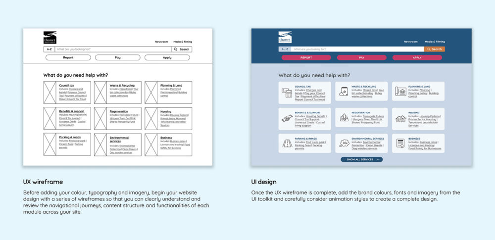
- Start with basic wireframes: Before adding your colour, typography and imagery, begin your website design with a series of wireframes so that you can clearly understand and review the navigational journeys, content structure and functionalities of each module across your site.
- Design for the client, not for trends: The user interface of the website needs to reflect the essence of your client’s overall brand and tone of voice. If it doesn’t, it can cause brand confusion, and users may lose trust.
- Conduct user testing: By observing how real users across different age groups interact with your site, you can learn how to balance the aesthetics and functionality to suit a broad range of audiences.
Interested in improving your website?
Start a conversation with us today, and we can help get your next project off the ground.