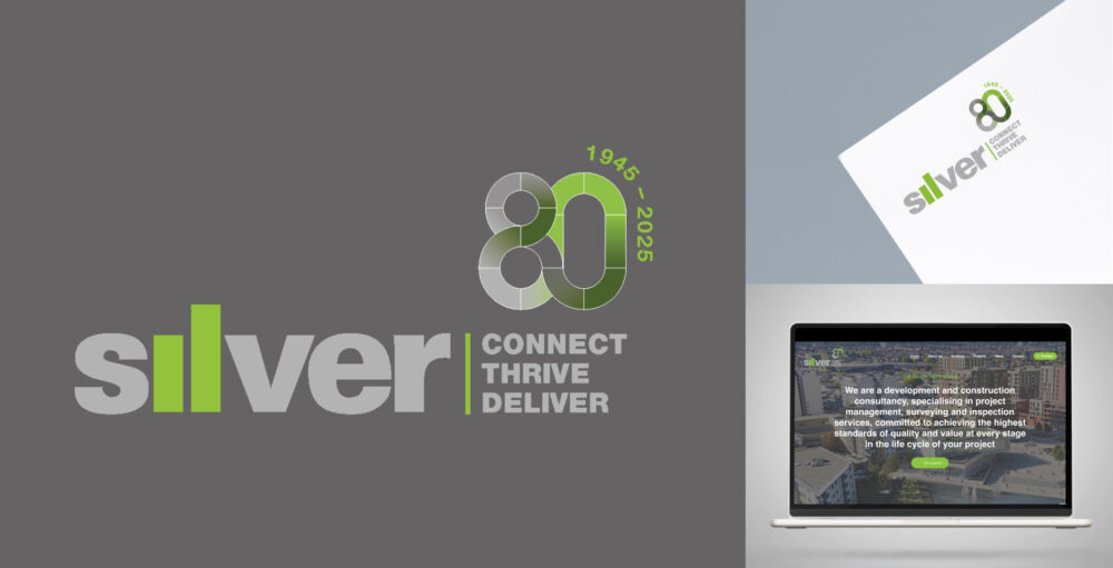
As Silver marks its 80th anniversary, the company has unveiled a refreshed brand identity that reflects both its proud heritage and forward-looking vision. Rooted in the values of Creativity, Passion and Respect, the new identity draws inspiration from the oak tree — an enduring symbol that perfectly captures the spirit of Silver’s journey.
At the heart of this rebrand is a new strapline: ‘Connect, Thrive, Deliver’, which encapsulates the company’s renewed purpose and commitment to its clients, people, and community. The updated logo proudly features this strapline alongside a distinctive motif of the number ‘80’, intertwined with the years 1945–2025, symbolising both legacy and progression.
The new branding is now live across all platforms, including the website, publications, and corporate reports. Tree imagery, themes of growth, and visual cues of longevity are woven throughout the company’s updated brand assets—most notably in a new vision document that sets the tone for Silver’s future.
“LUV Design presented several exciting concepts that closely aligned with our brief and, importantly, reflected our brand while celebrating our 80-year heritage. We’re delighted with the final outcome and appreciate the flexibility the refreshed logo delivers across our templates and marketing collateral.”
This milestone rebrand not only celebrates eight decades of excellence but also signals a bold step forward as Silver continues to evolve and lead with purpose.
We look forward to supporting Silver on future projects as they continue to connect, thrive and deliver.


