Design, digital, aftercare & support

Edgingtons Architects

Website redesign and brand refresh for one of the longest continuous RIBA Chartered Architect Practices in the UK.

The brief

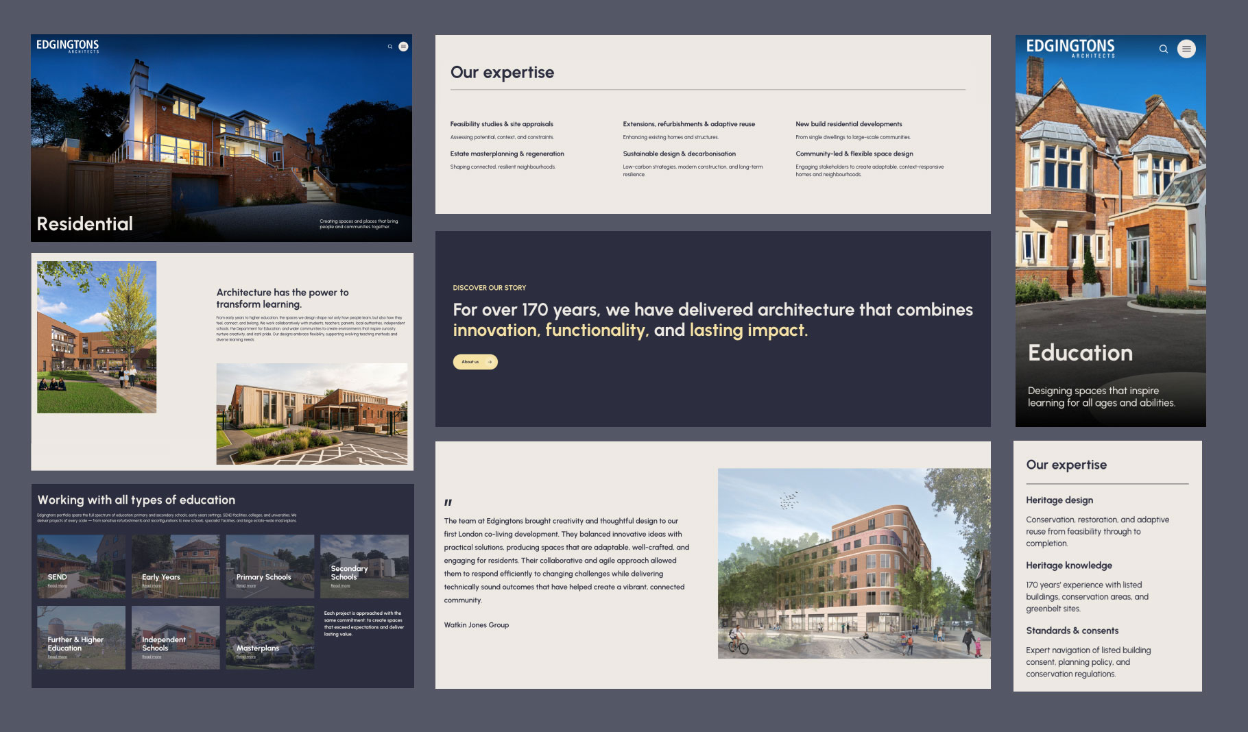
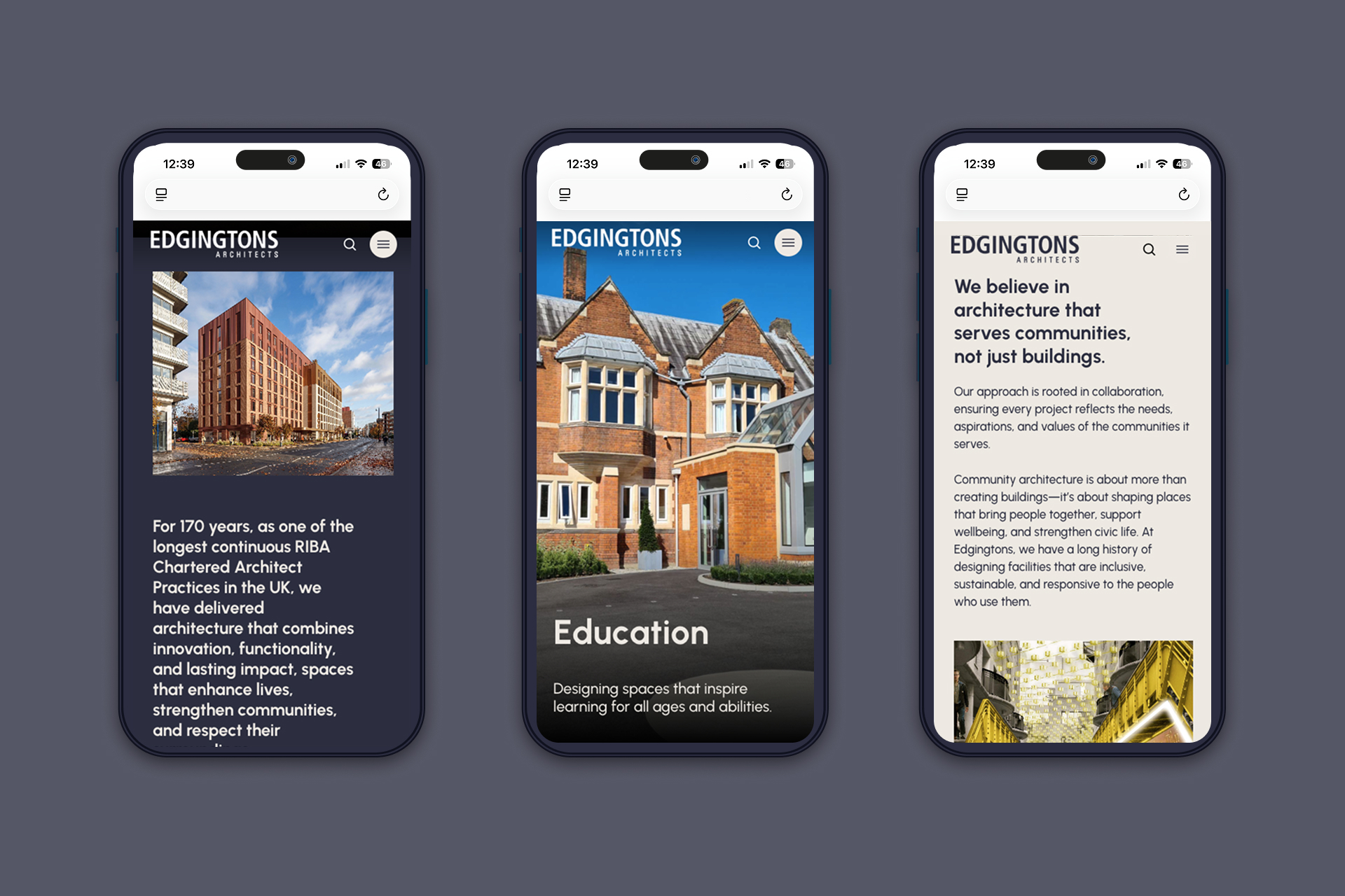
For over 170 years, Edgingtons Architects have been delivering architecture that has enhanced lives and strengthened communities across a broad range of sectors.

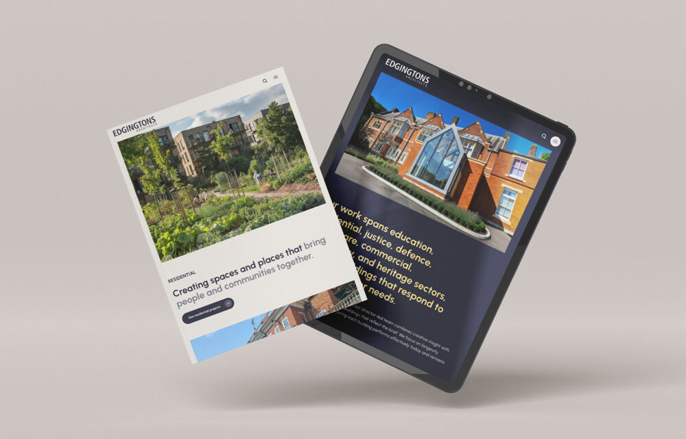
We worked with Edgingtons to help bring their digital presence up to date and showcase their outstanding track record with a new portfolio website and brand UI toolkit.
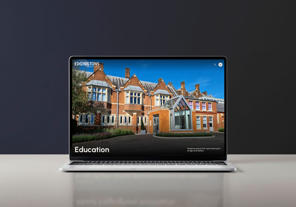
Our approach

From the kick-off meeting to the launch, we worked together with Edgingtons online and in-person to bring this new website to life within a time-sensitive delivery schedule. The digital transformation began with a thorough review of the information architecture, fine-tuning project-sector categories and services pages.

The new structure has now created more content-rich project and service landing pages, filled with high-quality photos, information, testimonials and links to case studies.

Website features

Featuring an impactful design, this new site includes dynamic structural layouts, typographic hierarchies, and animated videos to encourage potential clients and stakeholders to browse their extensive portfolio. The WordPress Page Builders capabilities give us full scope to create engaging modules, whilst giving us flexibility for adaptations in the future.

The project case study pages feature visually engaging galleries and high-level information, conveying facts and statistics about each project.

On the history page, a timeline was established to break down the Edgingtons’ extensive history into a visually digestible format.

A heritage brand with modern ambitions

A key part of the brief was establishing a core set of brand assets, including colour palette and typography, that could be used to form the UI toolkit, which embraced a heritage yet modern aesthetic.

The sophisticated muted charcoal contrasted with a light grey base creates a neutral backdrop, allowing the photos of the buildings to be the main focal point. A gentle pop of mustard-yellow is used as an accent colour on key touch bases such as buttons and hyperlinks.

Throughout the process, we collaborated with Edgington’s to find the right typeface to complement their existing logo and modern colour palette. When establishing a font choice, we always use Google Fonts due to its open source capabilities, allowing it to be efficiently used across various devices and printed materials for free. After trialling many combinations, the geometric sans-serif typeface ‘Urbanist’ became the perfect fit for the website due to its clean structure and clarity.

Testing and launch

With the assistance of the project management and platform, Basecamp, we were able to effectively communicate and resolve client feedback to create a high standard that was ready for launch. As part of our standardised process, we conduct thorough pre-launch checks before proceeding with launch.

End to End approach

Discovery

Communication workshop / Research and analysis / Information architecture

Design

New colour palette / New typography / UI Toolkit / Modular template generation

Development

WordPress Page Builder / Gravity Forms set up / Content migration

QA refinement

Quality assurance testing / Refinement / Prototyping testing

Deployment

Internal and external implementation

Project management

Project update meetings / Basecamp for project tasks tracking