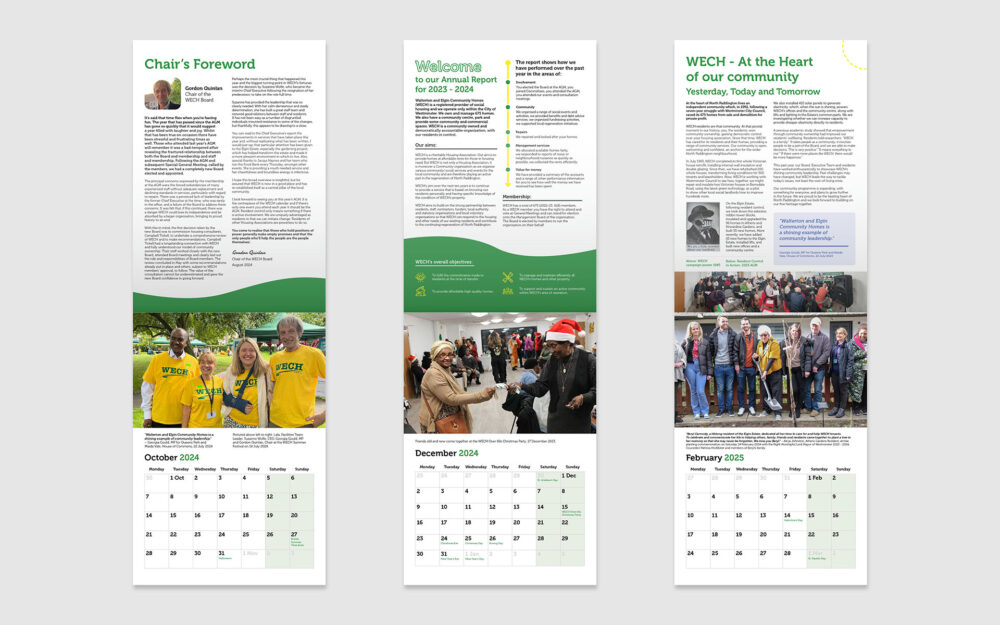
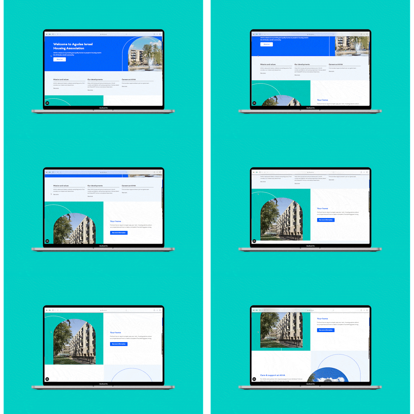
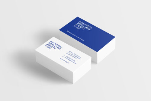
WECH approached and commissioned LUV to deliver and implement a range of creative outputs across multiple channels. They were looking for a dependable, creative agency to help them unify the brand where there was a lot of inconsistency in its implementation. This requirement extended across the review of the existing brand logotype, website, templates and printed media.
Challenges and solutions
One key aim of this collaboration was to establish a brand strategy that outlined a step-by-step process for achieving brand unification across all creative channels. At the start of this journey, we reviewed the existing logo and its uses across all communication platforms. The original icon logo held sentimental significance with the local residents and was strongly voted to be retained within the new design. Therefore, in order to modernise and improve on the wider design application, we recommended a typographic logo approach to be used alongside the original icon.
This approach creates a more accessible brand with clearer identification for potential stakeholders and new residents. The other challenge was to inherit and support a website uplift without an overhaul of the CMS setup. Luckily, the existing page builder offered enough flexibility to modify the frontend interface without affecting our desired output. We managed to enhance the site with new sections of content and considerably improved the navigation.
Project details
On the basis of the brand redesign and offline templates, we looked at modernising and simplifying WECH’s brand guidelines. Our designs replaced the existing elements that didn’t work well, e.g. fonts and colours, and we standardised the rest of the brand using an atomic design methodology approach. Leveraging the principles of our newly established brand guidelines, we also crafted an innovative A5 newsletter template design to be delivered quarterly to WECH residents. We collaborated closely with the WECH team and residents, transforming their latest news and events into visually engaging layouts.
We generated reusable design templates for community posters and newsletters to enable WECH staff to make edits. We also generated new workflows for website content updates and advised on additional surveying approaches for enhanced ongoing and internal tenant satisfaction metrics supplementing the Tenant Survey Measures data, including adding the ability to collate website feedback.
Promoting news and events across multiple channels was considered to foster community engagement and transparency, and the client wanted to encourage a digital shift to the website for their news and events content. We have supported WECH with user experience and content migration services on their website to ensure their content is easily accessible to WECH residents.
The results
We had positive feedback from the WECH community and enabled further engagement and co-design opportunities for the events and office interior branding applications. The staff are more digitally enabled to complete some of the tasks through our training, templates and up-skilling workshops, and we continue to support them as an embedded team on creative projects across various channels and evolve our collaboration with their resident stakeholders.


