

Our approach to the brand identity
With a history spanning over 50 years, Elgin Pre-school have seen generations of the same families come and go at their London-based pre-school.
With warmth and a ‘home-from-home’ atmosphere at the heart of Elgin’s ethos, the new brand identity needed to bridge two approaches: it had to be playful and engaging for children, yet trusted and professional for parents.
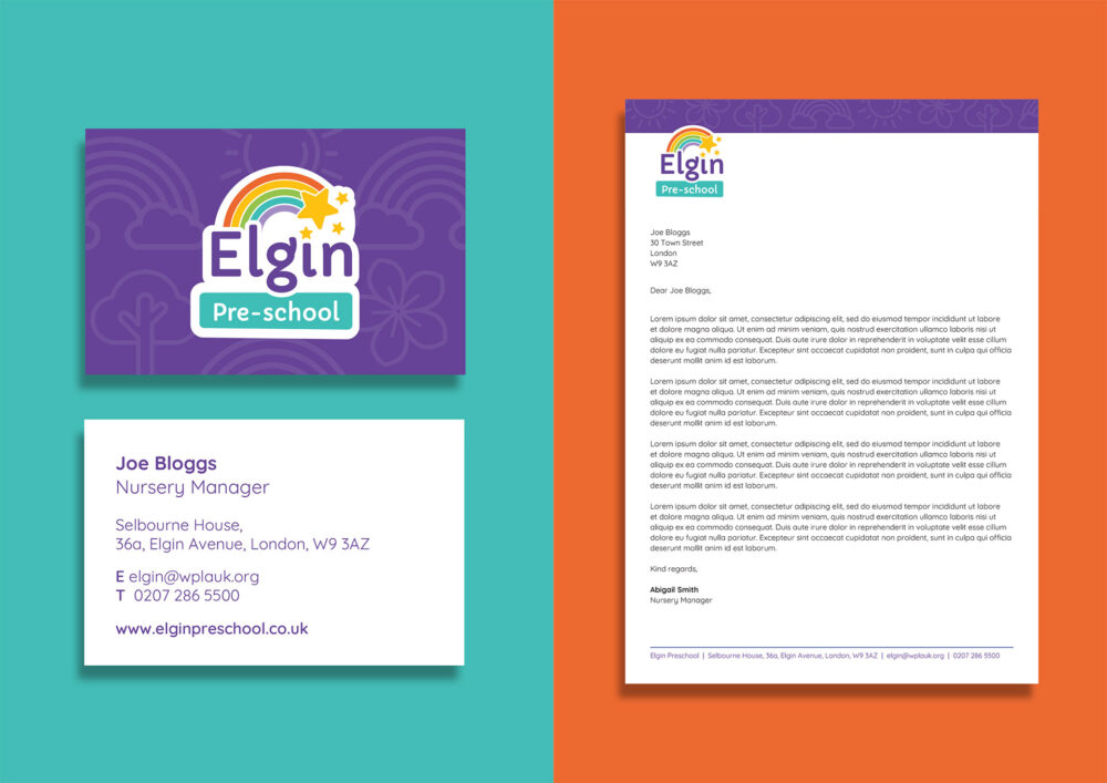
Working with Elgin, we presented a variety of different options to fit the brief. The chosen logo features a combination of rainbows and stars to communicate growth, inclusivity, and wonder. The characterful Google font ‘Capriola’ combined with the rounded ‘Quicksand’ font work effectively together to create a friendly, approachable aesthetic.
Establishing a brand toolkit
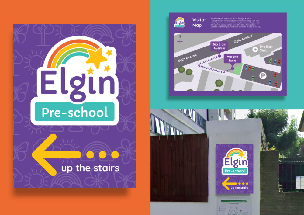
After establishing the logo, we developed and refined the color palette, font usage, and graphical textures to create a complementary brand toolkit. This foundation supports both offline materials, like signage, and digital platforms, including the website.
A playful combination of iconography, hand-drawn illustrations and shapes were heavily used throughout the design.
Guiding Elgin Pre-school every step of the website build
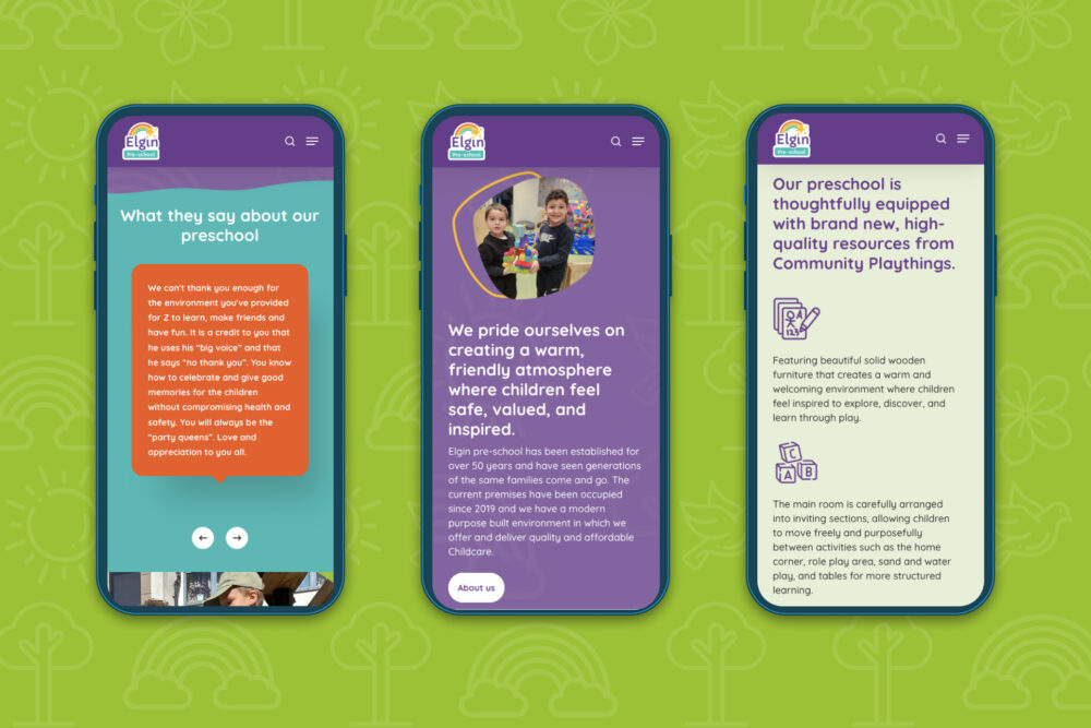
As well as a brand toolkit, we supported Elgin through each step of the web building process to create a responsive, modern, WordPress page builder site.
We established a new information architecture that organises content seamlessly for both current families and prospective parents looking to enrol their children.
You can explore the website by visiting: elginpreschool.co.uk
Want to collaborate with us on a website project?
We would love to hear about your project ideas or needs. Contact us today.
