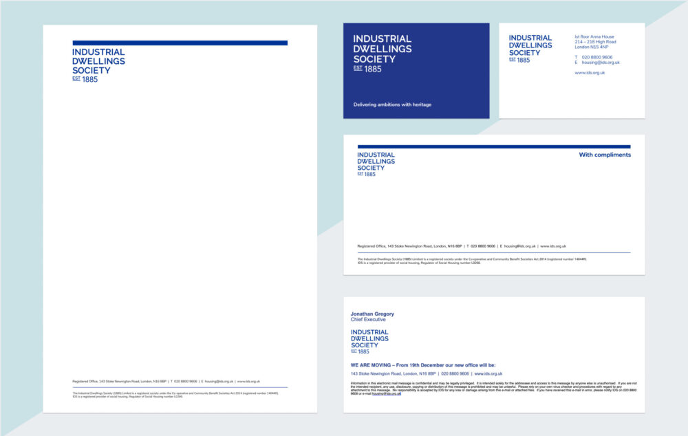
A consistent brand builds trust, strengthens recognition and ensures it is memorable across a crowded market. Over the years, we have been involved in a number of projects across built environments, public sector, healthcare and hospitality and we have delivered brand guidelines for the Industrial Dwellings Society, Llewelyn Davies and The Belgrave Hotel just to name a few.
Here is our guide to making sure your brand identity stays consistent across the web, in print and beyond.
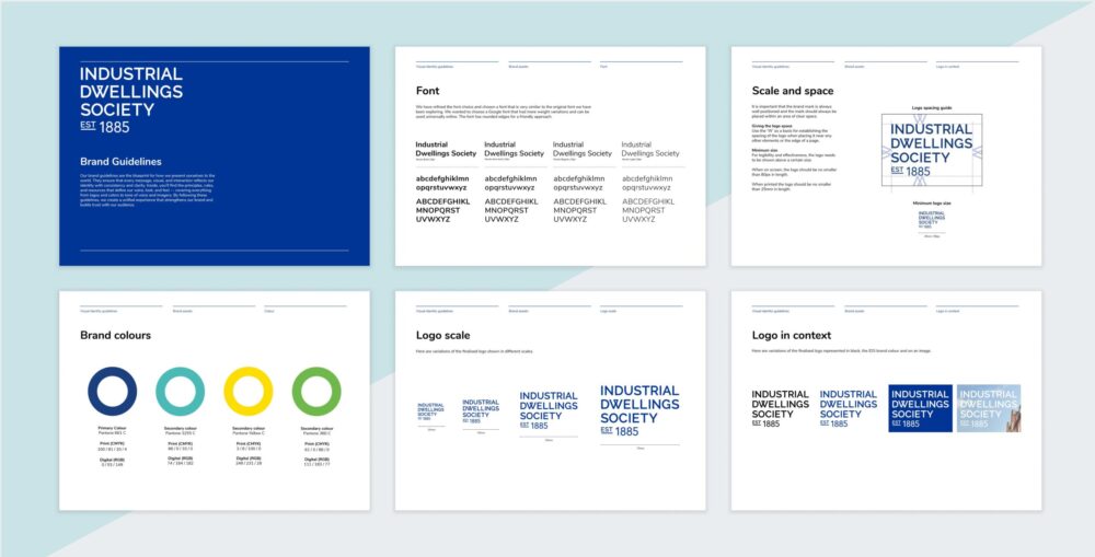
Creating a brand style guide
As part of our brand identity creation, we always establish a style guide which can be used as a blueprint for consistency across multiple platforms. This manual should clearly explain how your brand should look and feel across various contexts.
How to establish a good brand foundation
Your brand identity check-list should include:
- Logos (Primary, secondary and icon versions)
- Colour palette (HEX, RGB and CMYK values)
- Typography (Primary and secondary fonts)
- Image style (Photo guides, illustration approach and icon styles)
- Tone of voice
- How your logo should be used – The guide should outline how the logo should be displayed on top of imagery and on coloured backgrounds. In some cases, a white or lighter coloured version of the logo may be used on darker backgrounds for accessibility and vice versa.
- How a logo should not be used – For example, it should mention how the logo should not be stretched or altered in any way. Adding a guide on the minimum spacing between an object and the logo can make sure the logo is legible at all times.
- Examples of how the logo is applied through different formats and mediums (e.g. websites, murals, printed documents etc.)
Using the correct logo formats
The primary logo is the main, full version of a logo but in some cases, a secondary logo can be designed which shows a simplified version for smaller spaces such as on a sticky navigation header on a website. It is also beneficial to consider an icon version which could be used on social media avatars, app icons or favicon on a website.
Different logo file types
The logo should be on file in multiple formats to ensure the right file type is used effectively across each media.
The vector formats are beneficial as they can be scaled up and down without pixelating. This is essential for printed mediums. These file types are:
- .AI (Adobe Illustrator – editable source)
- .EPS (Encapsulated PostScript – widely compatible)
- .SVG (Scalable Vector Graphic – for web use)
The rasterised formats are primarily ready to use for digital channels and are browser compatible. These file types include:
- .PNG (can be exported with a transparent background)
- .JPG (an alternative to PNG but they do not have a transparent background)
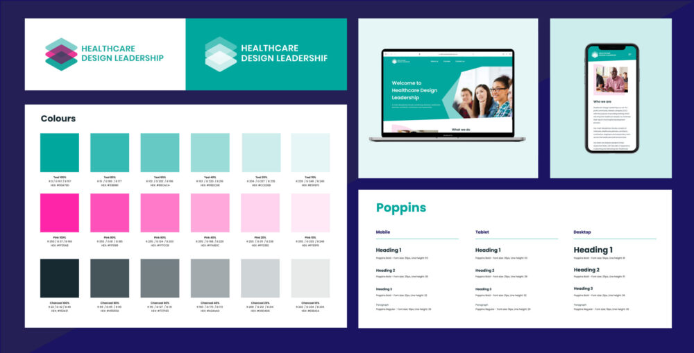
Acceptable colour combinations
When establishing a colour palette, a variety of colours should be provided so that there is a broad palette to work with. Using individual tints of your core primary and secondary colours can naturally help broaden your range of darker and lighter tones whilst sticking within the colour theme. Use a colour contrast checker to check your colour combinations are accessible for the web.
Font sizes and stylings for web and print
The guide should outline all the primary fonts used across each platform, including the weight and casing. For web, the font sizes and styling for paragraph and Headings 1-6 should be considered for mobile, tablet and desktop. Choose web safe fonts as they are compatible across all major platforms. Google Fonts is a great place to browse over 1,600 free font families that are optimised to work well on all major web browsers.
Approved photography styles and types of editing
The choice of photographic style and coloured filters can effect the overall mood and tone of voice a brand conveys. Details of the type of subject matter, composition, colour and lighting should be documented in order to create a recognisable and cohesive visual identity. The same approach should be considered for any illustrated imagery as well.
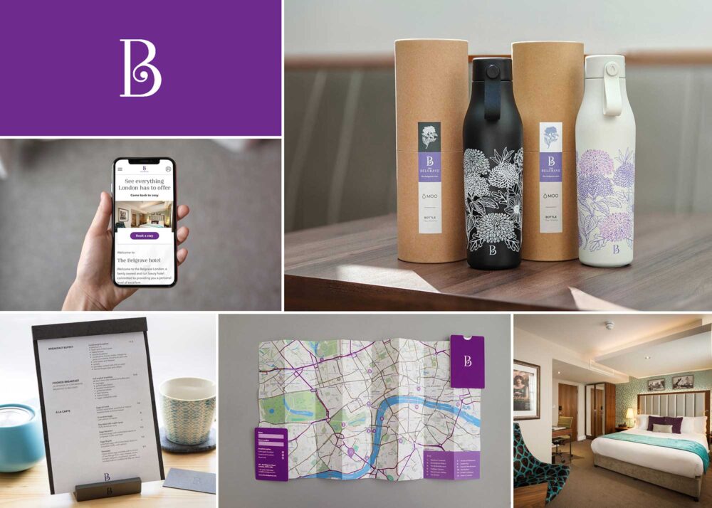
Designing branded templates
By establishing branded templates, you can save time setting up design assets from scratch and also improve uniformity. As part of our brand delivery process and output, we set up templates across Microsoft, Adobe and Figma software (dependent on client’s preferences) to make it easier to keep consistently branded assets for all staff members. The core assets that should be designed in the first instance include:
- Letterhead
- Email signature
- Website
- Social media templates
- Marketing collaterals (eg. posters, leaflets)
Consider your target audience for social media templates
It is important to consider the different types of audiences across each social networks when designing your templates. With ‘Reels’ now dominating the Instagram landscape, it is important to factor in how your brand is conveyed within videos and animation too. Accessibility is also very important to reach a wider audience so caption styles should also be considered for Instagram Reels and TikTok videos.
The overall tone of voice for each social network will vary. LinkedIn focuses on a professional, thoughtful, industry-focused approach where as Instagram is more visually and emotionally engaging. Facebook embraces a more community-orientated tone of voice and Youtube is more informative and narrative driven.
The overall tone of voice should remain recognisable but how you should express it can shift slightly depending on which channel you’re planning to make the announcement. For example, if you are going to an event, you might speak a bit differently at a business meeting, a dinner party, or when hanging out with friends so the same should apply to these channels.
Review your design practice
Over time, your brand will evolve which is natural but sometimes visual inconsistencies can begin to creep in. In order to make sure the brand touch points are consistent, have quick reviews quarterly or biannually to make sure everything is still in line. Even if it is small tweaks such as amending the casing of fonts, changing photos to suit the general style, it can make a big difference for consistency. We often schedule frequent check-ins so that we help guide clients one their brand usage consistency.
Final thoughts
Developing a comprehensive brand guidelines document does more than establish a strong and consistent visual identity, it also serves as a stress test for your brand system. By outlining how your brand elements should be used across a variety of platforms and scenarios, it ensures your identity is not only cohesive but also adaptable. A well-crafted guide helps future-proof your branding, giving it the flexibility to evolve over time while still maintaining its core integrity.
Interested in establishing a coherent brand identity in your company?
Start a conversation with us today, and we can help get your next project off the ground.