LUV adopts a design systems approach to ensure consistency or at least a strategic perspective in UI design, which is partly informed by Brad Frost’s Atomic Design methodology (2013) and through the implementation of comprehensive UI style guidelines (or UI toolkits as we like to call them). This design framework overlaps the UI and UX design processes to provide seamless user experiences, reinforce brand identity, and streamline collaboration across multidisciplinary teams. When set up properly, it can optimise design times and be used as a strategic visual validator or useful QA tool.
Drawing from our extensive portfolio in sectors such as healthcare, built environments, and public infrastructure, this article highlights the importance of UI style guidelines in contemporary design workflows and impact on project outcomes.

The history of UI style toolkits/guidelines
The concept of design systems dates back to early, static print media, where style brand guidelines ensured typographic, colour and editorial consistency. Ushered by the birth of digital design, this has expanded to address responsive layouts, interactivity, accessibility standards, and cross-platform compatibility.
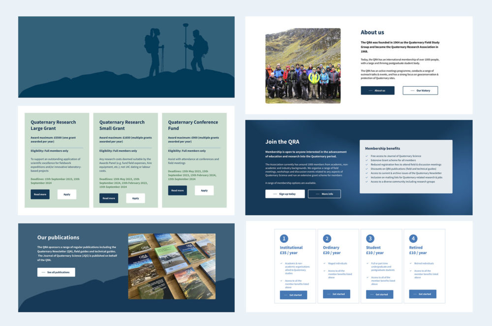
These are structured documents that standardise the visual and functional elements of digital products and more importantly, serve as a single source of reference for project stakeholders involved, ensuring uniformity and understanding of user interfaces. They are designed to be constantly evolving, as new scenarios or changes in best practice, might require further design or amendments to dynamic tools that evolve with technological advancements and user expectations. By codifying design decisions, they reduce ambiguity and accelerate development cycles, particularly in large-scale projects such as our work for NEST Pension and BGS.
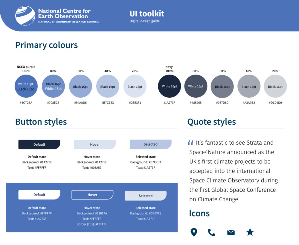
For example, during our redesign of the NCEO website, which was built on customising our client’s chosen modular theme, we still produced a detailed UI style toolkit to help guide this design extension process. We utilised the design system built into our Figma set up which enabled us to predefine new module states, blocks components and accessibility features like keyboard navigation—a collaborative practice now integral to our workflow for other projects.
Core elements of an effective UI toolkit
Each project will necessitate it’s own unique elements in the toolkit, which is driven by the hosted content types but for this article, we will summarise the core elements that we normally consider in most projects.
Typography
A well-defined typographical system establishes visual hierarchy, legibility and emphasis of text. Things we consider are fonts that prioritise for the web like optimised legibility, weights, licensing practicality and availability for other languages. We often leverage Google Fonts for their open-source versatility and deployment. Our toolkits establish font hierarchies i.e. H1–H6, body text, captions and underline link stylings.
Iconography and semiotics
Whilst we adjust to account for accessibility, we often use icons for added visual distinction and intuitive navigation cues. In our projects, such as the NEST pensions portal, vector graphics and icons were part of their new brand guidelines, which we then utilised further to indicate certain functions like the login on mobile (due to less screen real estate). We adhere to the principles of affordance—ensuring icons signal their interactivity, through subtle animations or state changes on hover.
Colour palettes
Sometimes existing brand guidelines may not have factored in WCAG 2.2 AA, so we always take into consideration to analyse them in detail to ensure that colour choices factor in WCAG 2.2 AA contrast accessibility for any legible or critical element like buttons or CTA headings. Any amendments or new colours added to existing palettes are client-approved before usage, or we work with the contrast friendly colour groups within the existing palette. On the outset, accessible colour palettes aren’t too different to standard brand guidelines, but are more stringent in their applications.
Layouts and grid systems
Grids provide structural coherence, particularly in responsive designs and most modern CSS frameworks utilise column based grid system like Bootstrap, Foundation, Tailwind etc. We adopt a 12-8-4 column grid (desktop/tablet/mobile) to ensure consistent spacing across different devices, and determine placement of stacking and positioning of content between each responsive transitions.
Interaction input or navigational elements
Pre-existing Figma templates can make this job much quicker and easier, but we still need to QA and check to account for all those form elements, search bars, menus so that not only we cater for all the input responses for different scenarios, our dev team are able to reference to exceptions to the norm. The close button and accessible labelling sometimes makes the design approach take a different form.
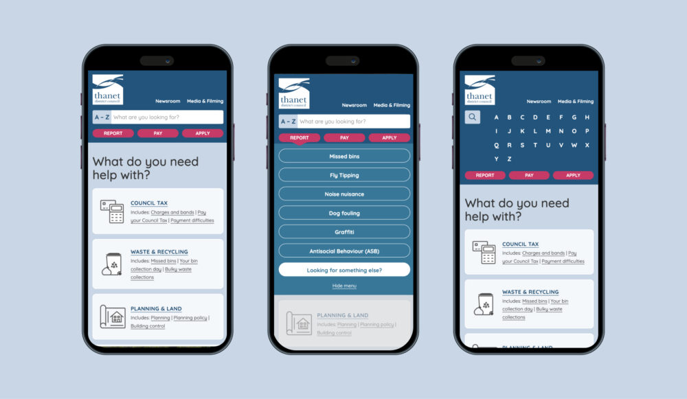
Device specific design
In addition to the grid system layout, we also critically need to understand the different ways we use devices comparatively. This also boils down to the different input methods or functionality available with the devices we use. For example mobiles have gyroscopes or accelerometers, accurate GPS built in, which means that compared to desktops or laptops, we can promote certain input methods more effectively. GPS can be used as an input for user location, which is something we built into the Thanet District Council site forms. It is now becoming more popular to use Wifi and IP location tracking on desktop but it’s less accurate, so it necessitates different approaches for some device journeys. Another example is that touch screens buttons also lack one less state (mouse hover).
Design system libraries
Figma’s symbols, components and asset libraries are a perfect match up with Atomic Design and creation of UI toolkits, allowing our team to work collaboratively in real-time and globally such as altering a button style or font that propagates changes across all connected instances, instead of updating the elements individually on each design page. This modularity proved essential for our client project and maintaining design consistency. Figma has a useful guide to component which we recommend reading if you use the software.
Conclusion
UI toolkits are more than digital design guidelines; they are strategic assets that help designers think with digital fluidity. For this reason, they aren’t static and we iteratively refine the guidelines as new journeys or specification changes are reflected. As digital ecosystems grow increasingly complex (especially with burgeoning VR and spatial interfaces), these frameworks will evolve to future navigational and content consumption experiences.
For organisations seeking to elevate their digital presence, LUV offers end-to-end expertise—from research and guideline development to seamless design build and deployment. Reach out to us to discuss your next digital transformation, UI/UX or web project.