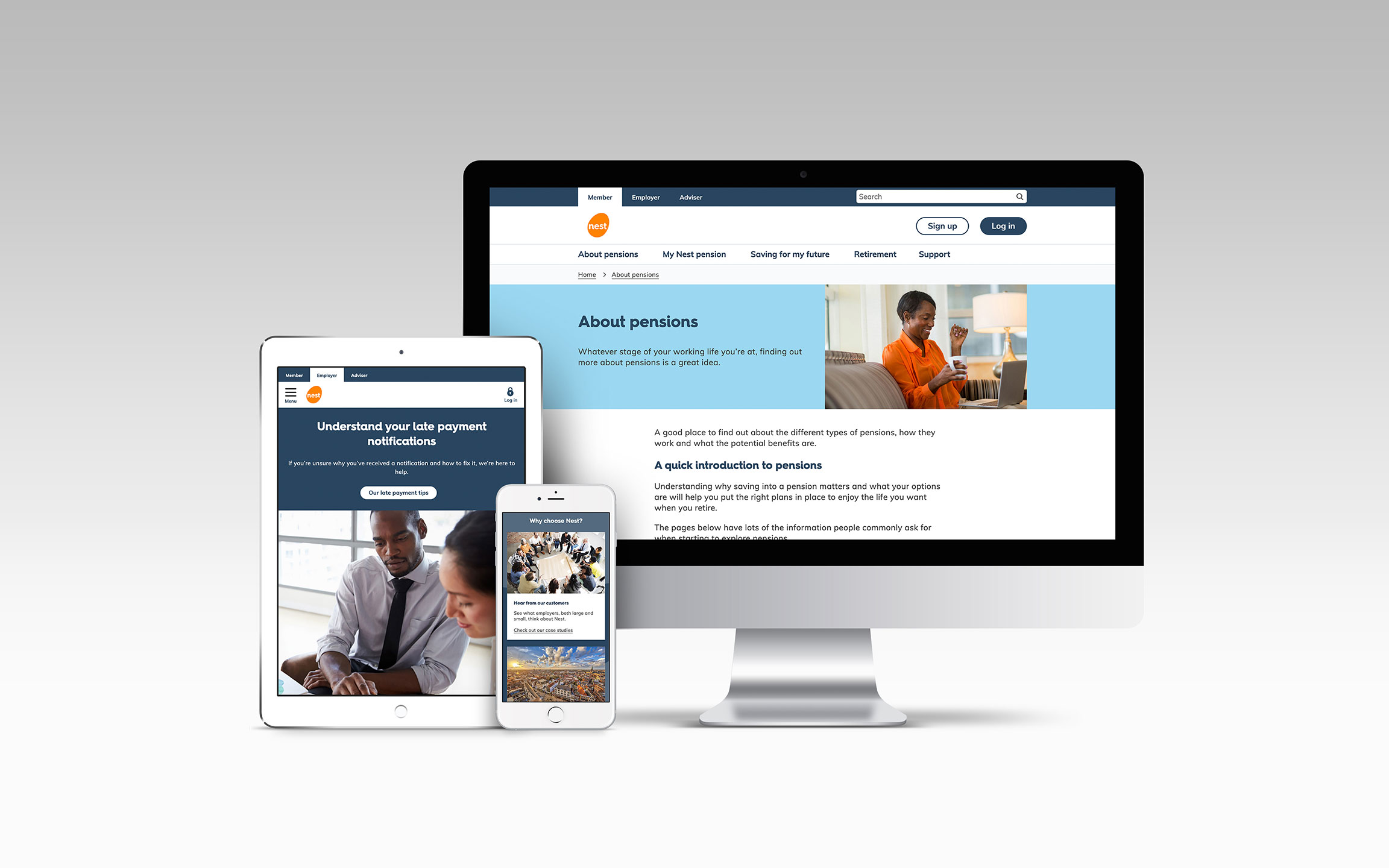

For organisations working at the forefront of science, research, and innovation, this is one of the most fascinating challenges in digital design. The problem is rarely a lack of information. In fact, it is quite the opposite. Research facilities often house decades of knowledge, hundreds of publications, sprawling datasets, and highly accomplished experts working across diverse disciplines.
The challenge is turning that massive volume of knowledge into something other people can actually navigate.
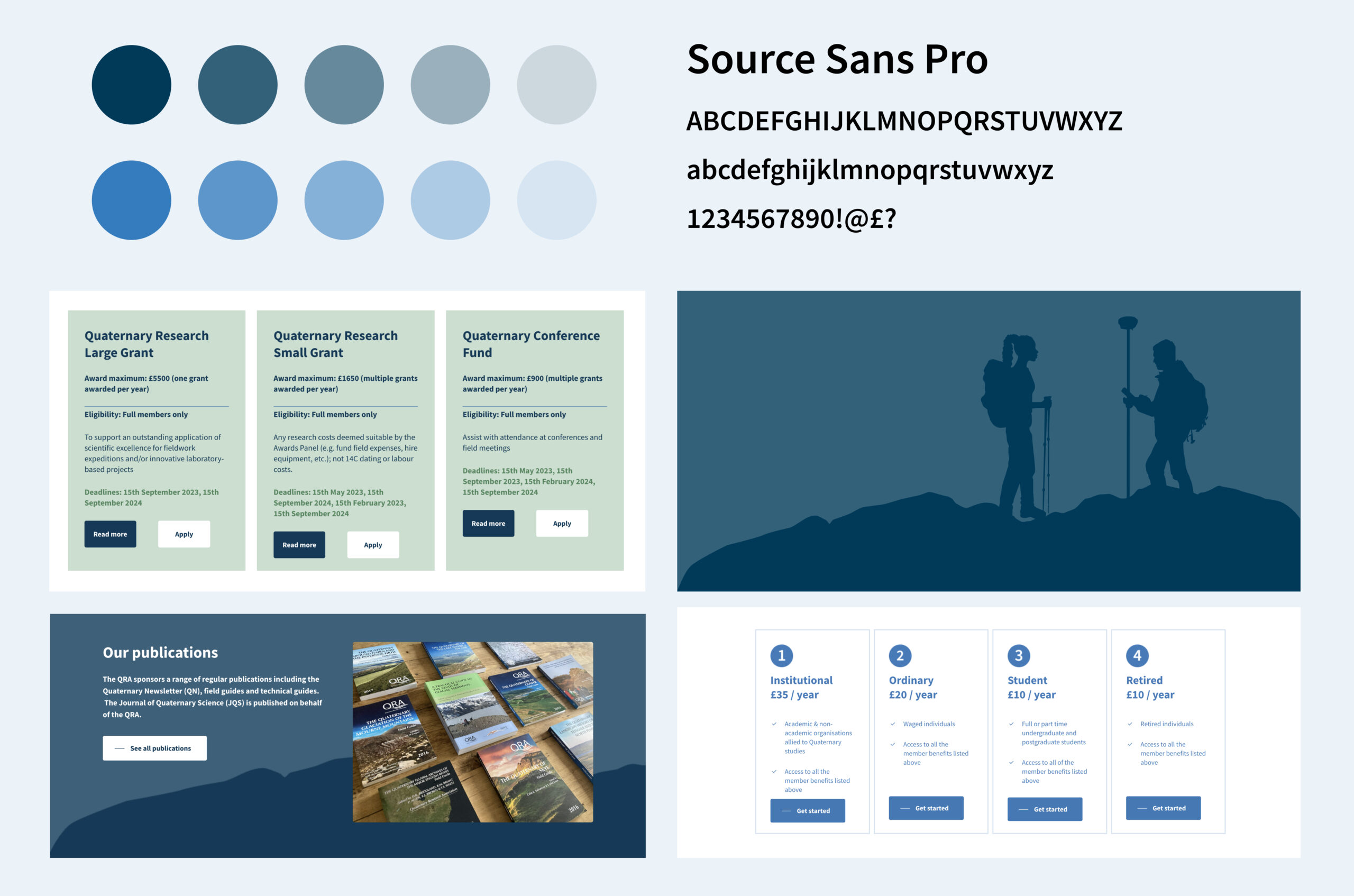
Through our work with UKRI-funded institutions like the British Geological Survey (BGS) and the National Centre for Earth Observation (NCEO), as well as specialist bodies like the Quaternary Research Association (QRA), we’ve reinforced a critical principle: good design does not simplify knowledge. It simplifies “the journey” to knowledge.
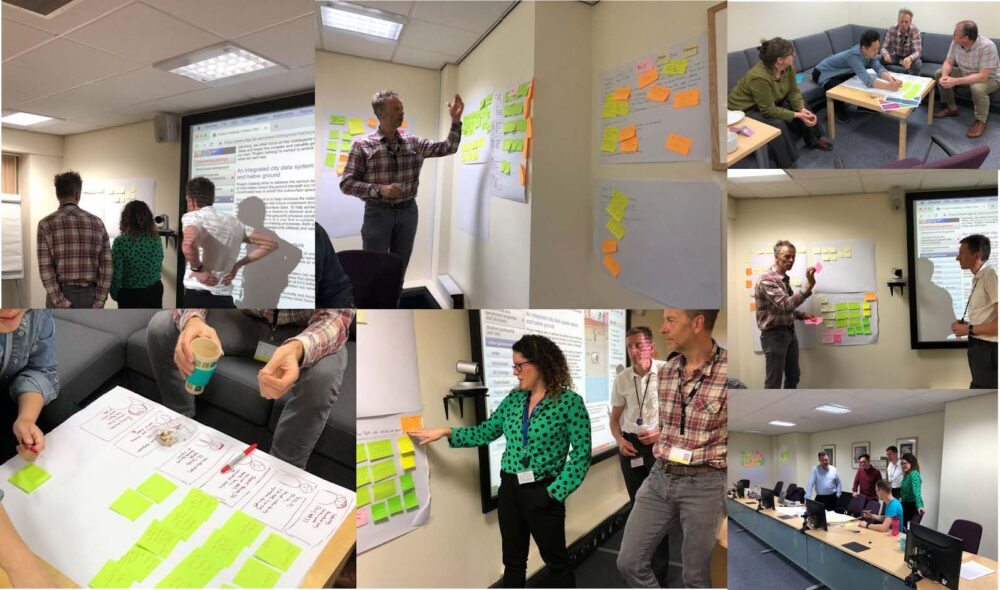
The danger of designing for the organisation over the audience
From our years of experience in the science, research and innovation sector, a common trap we noticed is that organisations naturally build their digital presence around how they operate internally. Content is structured by directorates, research programmes, funding streams, and internal departments.
But users rarely arrive with the organisation’s internal structure in mind.
- A postdoctoral researcher arrives looking for a specific dataset.
- A policymaker wants evidence-based findings.
- An industry partner wants to understand commercial collaboration opportunities.
- A member of the public simply asks, “What does this organisation actually do?”
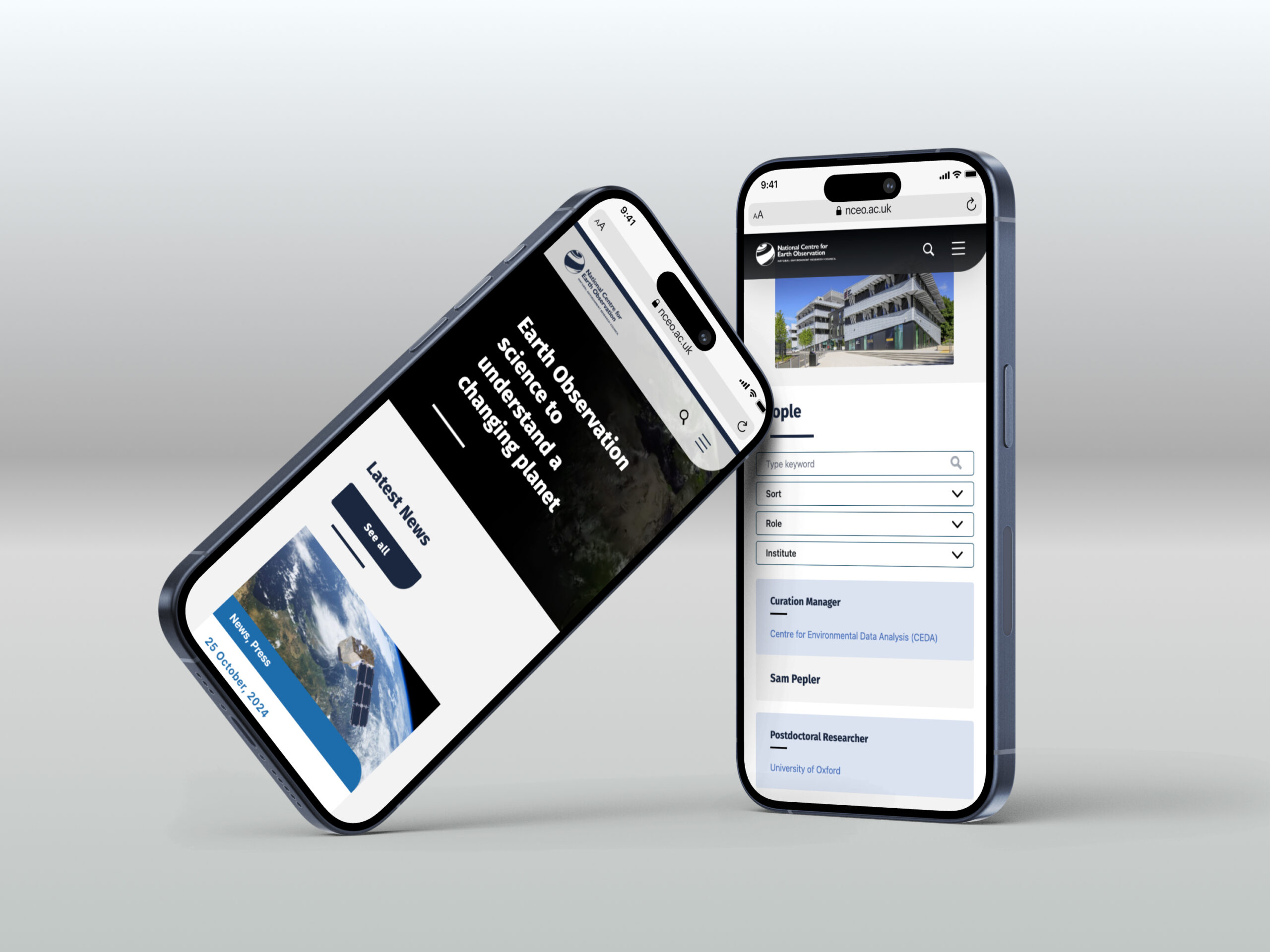
These are completely different journeys. That is why our starting point is always based on informational architecture. For our work with NCEO, we began by auditing how different audiences interacted with key content. The result wasn’t just another “website with a new skin”—we applied a fundamental rethinking of how complex information is structured and discovered.
Designing for people with varying levels of subject knowledge
From the perspective of staff who work in scientific communication, it’s easy to assume the audience already understands the subject. We’ve seen it before when acronyms and abbreviations are used, assuming everyone knows what they mean. However, research websites must routinely serve both laypeople/novices and deep-domain experts.
This challenge is not to make the content less scientific. It is to create audience-segmented paths to the same knowledge and provide progressive disclosure for newcomers. The underlying content or data must remain highly authoritative, while the surrounding dual-pathway experience becomes accessible. This is where information architecture, interaction design, and visual communication transition from “making things look nice” to acting as strategic tools and tailored entry points.
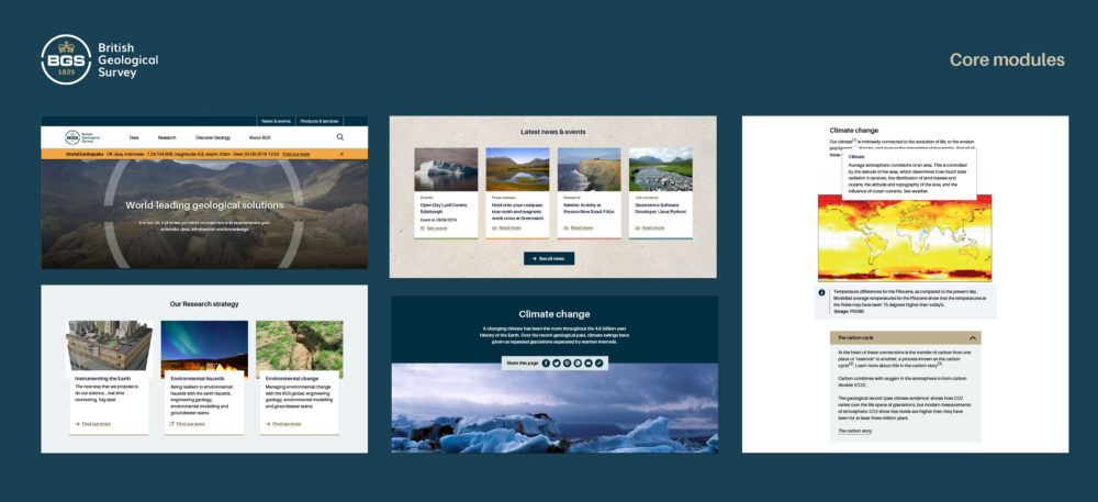
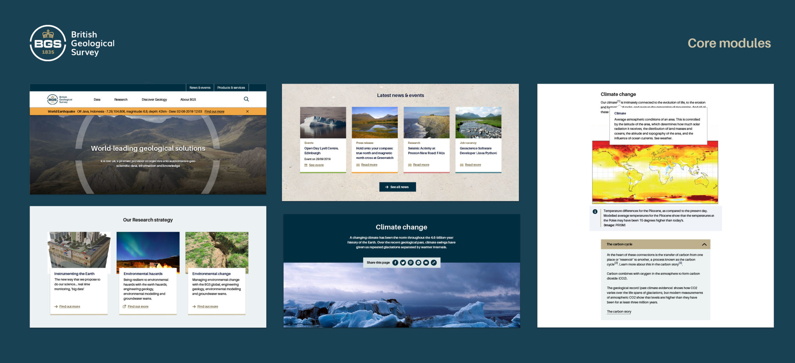
Take BGS, for example. As a major UKRI/NERC-owned research centre working across geology, environmental science, and Earth’s natural resources, credibility cannot be compromised—but credibility doesn’t have to mean complexity. Clear hierarchy, useful categorisation, strong wayfinding, and accessible typography are the structural elements that make the content’s authority easier to recognise. Collectively, they determine whether a user feels lost or confident.